Tuesday, November 19, 2013

Wall Street Journal Final Product

 Here is the original illustration by Harry Campbell from The Wall Street Journal. 


Here is a progress shot of my work from last Thursday.


And here is the final product which I finished today! I created the whole illustration with blob brush. My goal was to recreate the illustration in my own more organic style with more curvilinear lines as opposed to Campbell's very straight and precise style.


Wall Street Journal Project: Harry Campbell

Our latest project in Illustrator is to take an illustration from The Wall Street Journal and to attempt to recreate the illustration. The illustration I picked is this one by Harry Campbell.


Harry Campbell is an artist from Baltimore, MD, who focuses on illustration, graphic design, and editorial design. He also has delved some into screen printing. He creates illustrations for many different things, including art for editorials and The Wall Street Journal. He uses lots of outlines, bold flat planes of color, and creates the illusion of perspective with his lines and differing colors. His work is graphic, and not very naturalistic. He's most comfortable with "architectural right angled imagery" but is discovering how to work with more organic forms within the confines of vector art (http://drawger.com/hwc/?). His work lends itself well to imitation on Illustrator. Here are a few examples of his work.
(http://www.cmykmag.com/wordpress/wp-content/uploads/2013/06/Harry_Campbell__Dropbox.jpg)

(http://www.theispot.com/images/source/Harry_Campbell__On_the_Mark2.jpg)

(http://www.wired.com/magazine/wp-content/images/18-10/st_best_freebooks_f.jpg)

I've noticed that Campbell really seems to enjoy illustrating hands reaching into or interacting with his illustrations.


Here is the link to his personal website: http://www.harrycampbell.net/

Here is the link to his Behance page: http://www.behance.net/harrycampbell

Here is the link to his Drawger website: http://drawger.com/hwc/?cat_id=244;

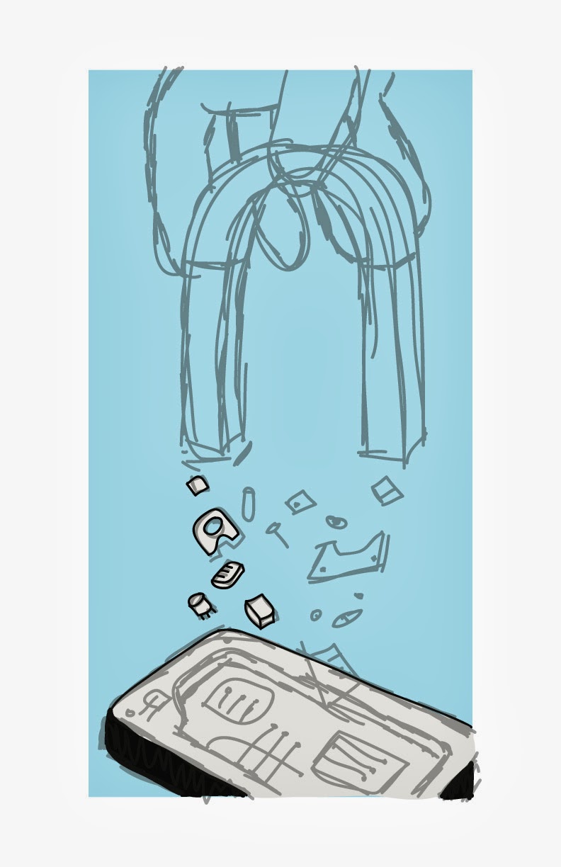
Here is the progress that I made on the illustration last Thursday.


I am recreating it in my own more loose and organic style, but maintaining the forms and colors. I'm using a wacom tablet and drawing everything by hand using mostly blob brush.

Thursday, November 7, 2013

Word Play Final Product


This is my final product for the Word Play Assignment. All I ended up changing was adding a climber. He really completes the piece. His red jacket makes such a nice contrast with the colors. Additionally, the fact that the rest of the composition is very illustrated and graphic with outlines contrasts very well with the realistic live-traced climber. It looks very imaginative and humorous having a naturalistic climber in this fanciful setting. I'm pleased with the outcome. 


As a reminder, here is what the piece looked like as a sketch and as an illustration before the climber was added.


And here is what the climber looks like. (https://blogger.googleusercontent.com/img/b/R29vZ2xl/AVvXsEi60MBzyduQEEC7zacfcAcDqJSxyfjUwT-YuXj5aKcA1IHokDIsxw_UYTq-93-ngSH5YRnmKMTQSv3fjjwyUOad7E85oaQ1R4_EmZ9nx6AltjHCHd7vdjUv6wUz3qSMc6G5AuKCHnW93iM/s1600/IMG_0027.jpg)


Here is what the climber looks like once he has been live traced. I simply scaled him to a smaller size and flipped him horizontally and rotated him a bit to fit him into my composition. 


Word Play Illustrator Progress


This is the progress I've made thus far on my word play project. 


It is based on the bottom sketch on this page. I have made some changes though. First I put the sketch into illustrator and outlined the sketch with the pen tool and used fills. I used blob brush to make the snow. Then I moved the letters farther apart and edited the L into an uppercase L versus the lowercase L just to make it a more recognizable letter form. I also removed the awkward top of the I and made a sun to be the dot above the I. However, I'm not sure if I'll keep it that way. I'm also currently working on illustrating a climber so I'll experiment with how a climber looks on the mountains. I added a shadow for the letter forms at one point but it didn't seem to work very well so I took it out. 

(https://blogger.googleusercontent.com/img/b/R29vZ2xl/AVvXsEi60MBzyduQEEC7zacfcAcDqJSxyfjUwT-YuXj5aKcA1IHokDIsxw_UYTq-93-ngSH5YRnmKMTQSv3fjjwyUOad7E85oaQ1R4_EmZ9nx6AltjHCHd7vdjUv6wUz3qSMc6G5AuKCHnW93iM/s1600/IMG_0027.jpg)

This is the reference image of a climber that I'm thinking of using. 


Monday, November 4, 2013

Word Art Rough Sketches

Here are some rough sketches that I made of ideas on how to illustrate the word "climb."


The first one here is pretty awful, but I was trying to experiment with a mountain shape. I like the second one in this set though, it's supposed to suggest the climbing of snowcapped mountains. It looks quite clean and straightforward.


This sketch is climb illustrated as stairs.


The top sketch on this set is climb on stairs, which I really don't like. And honestly, I think much more of mountains and trees when I hear climb than I think of ladders. The second two are bad portrayals of climbing trees.


I think this sketch of a climb as illustrated by a child climbing a tree is kind of cute, so I might experiment with that some more.